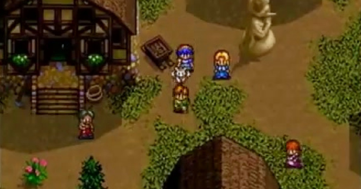
If you think 8-bit visuals automatically mean “primitive,” this list will happily prove you wrong. Inspired by Renkai Games’ video The 11 Most Beautiful NES Games That Still Look Amazing!, we wanted to go deeper: why these games still look incredible today, what most players miss about their art direction, and how to actually jump in and play retro games online with friends.
Because yes—good pixel art never dies. It just gets sharper in your memory.

The 11 NES Games from the Video
Here are the featured titles from the video:
- Kid Dracula (Akumajou Special: Boku Dracula-kun)
- Moon Crystal
- Mitsume ga Tooru
- Teenage Mutant Ninja Turtles III: The Manhattan Project
- Yume Penguin Monogatari
- Adventure Island IV
- Tiny Toon Adventures 2: Trouble in Wackyland
- Zen: Intergalactic Ninja
- The Young Indiana Jones Chronicles
- Bucky O’Hare
- Vice: Project Doom
Great picks—and importantly, not just the same old “top 10 NES” list.
Why These Games Still Look So Good
The short version: they use constraints better than many modern games use unlimited resources.
1) Smart color contrast beats raw color count
The NES palette is limited, but games like Bucky O’Hare and TMNT III use contrast aggressively: bright characters, dark outlines, clear foreground separation. That means motion and hitboxes stay readable even in chaotic action.
2) Animation economy creates style
NES sprite memory is tight. The best artists used fewer frames but posed them with strong silhouettes. Zen: Intergalactic Ninja is a good example—punchy, readable animation with just enough exaggeration to feel alive.
3) Tile reuse is hidden with composition
A lot of “beautiful NES graphics” are clever tile recycling masked by camera flow, palette swaps, and layered patterns. Moon Crystal especially feels richer than its raw tile budget should allow.
4) Late-era Famicom/NES teams mastered the hardware
Several of these are late-generation games. By then, developers had years of practical tricks: cleaner scrolling, better sprite multiplexing, richer scene transitions, and stronger UI integration.
5) Art direction > technical specs
The visual identity is cohesive in each game. Kid Dracula commits to playful gothic parody. Yume Penguin Monogatari commits to absurd, colorful character comedy. They’re memorable because they have a point of view.
Deep Dive: What Makes Each Stand Out
Kid Dracula
 Konami flexing pure charm. Big expressive sprites, playful horror motifs, and comic timing in animation. This is “cute gothic” done right decades before it became mainstream in indie aesthetics.
Moon Crystal
 One of the best examples of cinematic platformer staging on NES. Smooth scene transitions, dramatic movement, and a darker visual mood that feels way ahead of typical 8-bit presentation.
Mitsume ga Tooru
 Character readability is excellent, and background choices consistently support gameplay. It’s a great case of anime-style source material translated into practical, clean NES visuals.
TMNT III: The Manhattan Project
 It nails arcade-like energy on home hardware: bold enemy sprites, expressive hit effects, colorful stage identity. Multiplayer chaos stays readable—huge achievement on NES.
Yume Penguin Monogatari
 Weird in the best way. Distinct character art, comedic tone, and unusual visual direction make it instantly recognizable. A reminder that aesthetic bravery ages better than generic polish.
Adventure Island IV
 Late-gen refinement with stronger environments and cleaner iconography. Its world readability helps exploration, which is crucial for a game with light progression structure.
Tiny Toon Adventures 2
 Konami again: fantastic character motion and cartoon-inspired timing. The game understands that movement personality is visual design, not just gameplay feel.
Zen: Intergalactic Ninja
 Sharp comic-book vibe, dramatic color use, and animation that sells impact. It looks “cool” in a way many NES action games tried but didn’t quite reach.
The Young Indiana Jones Chronicles
 Underrated for environmental storytelling. Stages communicate theme and geography clearly without drowning in detail, which is exactly what 8-bit art should do.
Bucky O’Hare
 A technical and artistic highlight. Fast action, bright palettes, confident sprite work, and stage variety. It still feels premium.
Vice: Project Doom
 Cinematic ambition with noir-ish presentation and strong tone control. It mixes action and atmosphere better than most platformers of its era.
What Most People Miss About “Beautiful NES Graphics”
Most discussions focus on screenshots. But NES beauty is really about motion + readability + mood.
A static frame can look simple. In motion, you see the craft:
- How quickly your eye finds threats
- How clearly character states read
- How backgrounds frame movement lanes
- How effects punctuate impact without visual clutter
That’s why some games with “less detail” actually look better while playing.
Rebit Angle: Play These Classics the Right Way Today
Watching a video list is fun. Testing these games yourself is better.
On Rebit, you can play these kinds of titles in-browser with no emulator setup, and jump straight into netplay when you want to compare stages, race clears, or just run co-op chaos with friends.
Practical ways to use Rebit for this list
- A/B visual comparisons: Try two games back-to-back to feel differences in animation philosophy.
- Netplay art night: Pick 3 titles and discuss stage art live while playing (yes, serious nerd mode).
- Version curiosity sessions: For titles with region variants, compare how presentation changes.
- Challenge runs: Track which games stay readable under speedrun pressure.
- Multiplayer retro gaming tests: See which games remain visually clear in shared-screen chaos.
Quick Start
- Sign in to Rebit
- Pick one of the featured NES titles (or similar classics)
- Launch in browser
- Invite a friend via netplay room link
- Compare notes: animation, palette contrast, stage readability, visual identity
If you want lower-latency session tuning and advanced setup details, check the multiplayer netplay documentation. For more NES-specific setup context, use the play NES games online landing page.
Final Take
The NES didn’t win on raw horsepower—it won on intentional design. These 11 games still look amazing because their teams made every pixel do real work.
If you’re into retro aesthetics, this list is worth more than nostalgia. It’s a mini masterclass in visual design under constraints.
Try the games, test them in motion, and then tell us which one aged best. We’ll probably argue back (politely) in true retro nerd fashion.
Ready? Sign in to Rebit, spin up a room, and start playing retro games online with your crew.
Rebit does not provide copyrighted ROM downloads. Use legally owned NES files from your own collection so the visual comparison stays focused on play, preservation habits, and clean session setup.